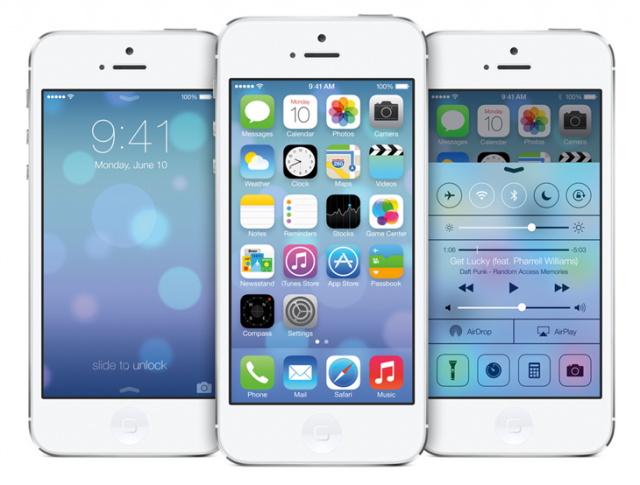
Apple’s WWDC is in full swing, and arguably the biggest part of its keynote yesterday morning was the unveiling of the new iOS 7. Now that iOS 7 has been announced we can formally pit the two biggest mobile operating systems head to head. It’s go time – Android 4.2 Jelly Bean vs iOS 7 – in an all out fight to the death (or at least till one smartphone runs out of battery, whatever comes first).
iOS 7′s new look is almost the same minimal user interface Android users have been enjoying since Android 4.0 Ice Cream Sandwich debuted back in 2011. It was then Matias Duarte showed the world his beautiful “Holo UI” which placed emphasis on a simple, minimal design as well as the all new Roboto system font. This was seen as a rebirth for Android, (oddly enough, Apple calls iOS7 “a new chapter for iOS”) which typically relied on its utility rather than its good looks.
Android users are used to Apple biting off the OS, waiting for Google to do all the heavy lifting, before they swoop in and rebrand these ideas their own. Whether it’s multitasking, or their “Notification Center” – we’re starting to get used to it.
Since Apple is boasting the upcoming iOS 7 update as “the world’s most advanced mobile OS,” we figured we’d put that claim to the test. Let’s take a quick look at the UI from iOS 7′s all new applications, along with their new features and see how they compare to the current reigning champ, Android 4.2 Jelly Bean.
Home screen and lock screen
First up, iOS’ trademark lockscreen is now gone. Almost feels less Apple-ie not seeing it there (especially after they went through the trouble of patenting it), but they’ve really committed to minimal with their latest version. Nothing but text, and directions to “slide to unlock,” it’s plain and we can’t help but wonder how much more functional it would be with widgets.
The homescreen features a lot more eye candy this time around, with bright, flat, colorful icons that look very similar to the color pallet used with Google Play. The homescreen actually works with the gyroscope and when you tilt the phone, allowing you to almost see behind the icons. You may remember how jazzed I was to show you guys this feature last year with a free app called 3D-Effect Live Wallpaper. Yeah, it was pretty sweet. What’s next Apple, live wallpapers? Guess they gotta save something for iOS 8.
Apple says, they ran out of “felt and wood,” for iOS 7 which gave me a chuckle. While iOS 7 is definitely very minimal, I wouldn’t quite call it “Holo” or even Metro. There are no sharp edges to the design and everything has a very rounded look, more in tune with the UI from Any.Do (now available on Google Play) or the MIUI custom UI.
We can’t help but wonder if Apple was taking a jab at the competition when they said, “We don’t add features simply because we can… We add features only when they’re truly useful.” My take away was Android is apparently chock-full of features, but not all of them are actually useful. Guess Apple really loved our quick toggles because….
Control Center
Yes, quick toggles to quickly turn on/off basic system functions is one of the most useful features ever. I’ll admit, this also took awhile before we saw it integrated into stock Android, but like most things, we’ve been enjoying these since the early days of TouchWiz and Sense many years ago. We’re glad Apple finally found them “worthy” of including into iOS 7.
Mail, Weather, Messages
Like all the other apps, mail, weather, and messages were given a visual overhaul. Mail and messages now look very minimal and clean (gone are the hideous bubbles conversations we’ve since since iOS 1) and from what I’ve read, now feature swiping gestures to delete.
The new weather app was given a lot of attention during Apple’s presentation and while we admit, it is flashy, we’d just like to point out the fact that this is the same Yahoo app already available on the App Store and looks about as nice as the Sense 5 weather application. Something tells me Yahoo wont be updating the Android version of their app anytime soon. The thing is when it comes to weather, most Android users are used to not having to open an app to view it. We have the weather on our lockscreens, homescreens (and in Sense 5, BlinkFeed and app drawer) — so why go through the hassle of opening an app (unless you want extremely detailed info) when it’s always viewable at a glance?
Camera, Safari, Siri
Camera has gotten an all new look. There’s a lot of transparencies and yes, a more minimal UI. Users can select to crop a photo ahead of time for easy to posting to Instagram, and filters viewable in real time make it easy to post hipster photos directly to social networks without having to rely on Instagram. Of course (you knew this was coming), Android users have had multiple camera applications available in the Play Store that mimic this functionality to a tee. Apps like Camera 360 perform all these “new” iOS 7 features and more.
Safari has been updated with a smart search field that works similar to Google’s omni search bar. It’s also been updated with Google Chrome-like 3D tabs, which we found interesting. Whether you’re on iOS 6 or Android, you might want to try downloading Chrome for all these “new” features and more (tab syncing, games, etc.).
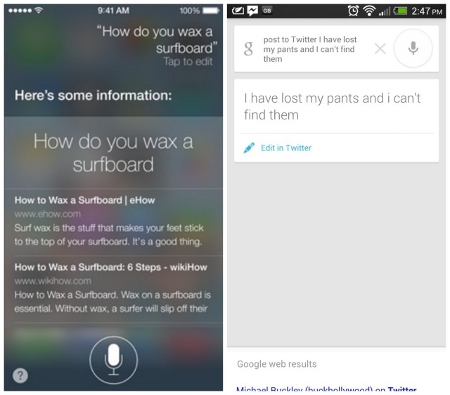
Siri was also given a revamp, and where some Android OEM’s have gone out of their way to copy the old UI (I’m looking at you, Samsung), it’s now super minimal, with a kind of glass UI that allows you to still see your homescreen underneath.
Apparently Siri’s also been given a bevvy of new features like better Twitter and Wikipedia integration, as well as the ability to pull up searches directly from, uhhhhh.. well this is embarassing….. ummm, Bing. I did like the ability to choose between male or female Siri in a variety of languages, so Apple definitely gets points there. Overall, Google Voice Search is improving everyday and because Android is becoming more modulated, users no longer have to wait for an entire firmware update before they can get updates with the latest features. This means Google Voice Search has the potential to advance at a much quicker pace and we’re sure something Google is focusing on.
iTunes Radio
Apple has also introduced their new iTunes Radio which some are labeling a “Pandora killer.” It offers the similar functionality, allowing users to listen to music stations and buy a songs on the fly. It’s ad-based, but for iOS users who sign up for iTunes Match (where they store their music in the cloud for streaming), can get it ad-free. Google recently updated Google Play Music with similar functionality, giving the app the ability to play music stations, purchase music, stream music stored in the cloud, oh — and/or pay $8 a month to stream all the music they want, when they want. Boom.
AirDrop
AirDrop is probably my favorite feature from iOS 7. Basically, it’s makes sharing photos with other iOS users a wonderfully simple process. If someone near you is in your contacts, you simply select the photos/videos/files you want to send, then the contact and boom. You’re off. Android Beam has been around since Android 4.0 and allows you to beam photos, contacts, webpages, and apps to another Android device using NFC but in my usage has been rather finicky (especially with smartphone cases getting in the way).
We’ve also seen similar implementations from manufacturers running custom UI’s on Android, but tapping devices together seems almost barbaric vs wireless. Because not every Android device has NFC built in, that too is a downside. Fortunately, there are other options like Bump which allow you to send not just photos, but share any file on a device with others (protip: you don’t have to physically bump devices to transfer, just shake them near each other).
Multitasking
Apple has finally got on the ball and introduced multitasking across any and all applications downloaded from their App Store. It took them awhile, but it looks like they’ve finally caught up to Android by simply keeping all apps open in the background. Their implementation is visual very similar to WebOS, allowing for the user to pull up cards of all the apps opened in the background, swiping them up off the screen to close them out. It’s definitely pretty but again, something Android users have been enjoying for quite some time now.
Calculator
While all the iOS 7 systems apps have been spiffed up, I just found it interesting how visually similar their new calculator app was in comparison to Androids. While it’s true, there’s only so much you can do with a calculator UI, if they rounded out the corners it’d be less obvious where their app drew its inspiration.
Conclusion
The point of this post wasn’t to simply trash Apple or iOS 7. I was genuinely excited to see something new out of WWDC and was kinda bummed out to walk away empty handed. Like some of you, I actually enjoy a good fight and I know that good competition fuels innovation and pushes companies to try harder and deliver even better products. While it’s sad to see Apple no longer the “innovator” they once were, Android users now have OEM’s like Samsung and HTC to turn to for new ideas in terms of hardware and software.
You’ve really got to hand it to the Android developers, they’ve really done an incredible job at making Android not just functional, but beautiful as well. So beautiful it seems Apple is now looking to Android for design ideas, instead of the other way around. When it comes to the next version of Android _._ Key Lime Pie, Google may have only to outdo themselves


